Incorporating green in home design is the haute new trend in 2017. Pantone’s 2017 colour of the year Greenery and 2013 colour of the year Emerald have made this evergreen hue a huge design for over four years. A bold move, it inspires healthy living, bringing the outdoors inside, an overall brighter feel to the design. Here are some ways you can freshen up your space with similar tactics.
Curve Interiors – Beck Glass 
Courtesy of Design to Inspire
Incorporating Green in Home Design and More
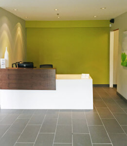
Be bold and add a pop of colour to the wall. For our clients we used a shade very similar to Pantone’s Greenery 15-0343 behind the reception desk Benjamin Moore Martini Olive CSP-890. Both saturated greens look striking against the white millwork. If you love the second colour we suggest going with Benjamin Moore Clover Green 2034-10

Courtesy of Growing Spaces 
Style Files
You can never go wrong with introducing real greenery indoors. It’s a quick and easy way to brighten up any space. These cute hanging planters will add a new dimension to any room and create interest above eye level. You can find similar ones from EQ3. On the other hand, a large plant (we love the look of a fiddle leaf ficus tree) layered amongst art or your furniture setting is a great way to add life to the space.

Curve Interiors – Beck Glass 
Courtesy of Cox & Cox
Play with green accessories. Artwork or a unique furniture piece is a great way to add personality and colour to your space. Green and grey pair together effortlessly and if you checked out our previous post you can find our favourite grey tones.
Courtesy of Sadolin 
Courtesy of The Analog Eye
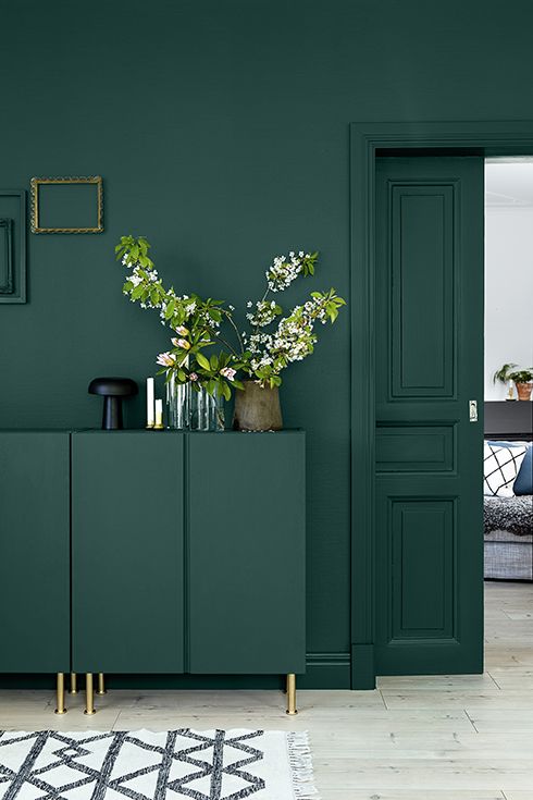
So much green and it’s not overwhelming in the slightest. Green millwork was the rage in the 50’s and 60’s and it’s slowly coming back in style but with cleaner lines for a more contemporary feel. Pair with gold hardware for a timeless and trendy look. If you’re inspired by these colours we suggest going with Benjamin Moore Dragonfly AF-510 for the left picture and Pantone Greenery 15-0343 TPG if you love what’s happening on the right.